How to Check Color Contrast for WCAG AA and AAA (Free Online Checker)
Light grey text on a white page can look fine on your monitor and be almost unreadable on a phone in sunlight. The ToolTiny Color Contrast Checker gives the exact contrast ratio of any text and background color, shows which WCAG levels the pair passes, and suggests the closest colors that do. This guide follows a 58-second screen recording; every color value and ratio below is the one shown on screen.
WCAG Contrast Levels at a Glance
The tool checks five things at once. These are the limits it showed on its five cards:
| Check | Needs | WCAG criterion |
|---|---|---|
| AA Normal Text | 4.5:1 | 1.4.3 |
| AA Large Text | 3:1 | 1.4.3 |
| AA UI & Icons | 3:1 | 1.4.11 |
| AAA Normal Text | 7:1 | 1.4.6 |
| AAA Large Text | 4.5:1 | 1.4.6 |
Large text means 24px regular or 18.66px bold and bigger. The preview in the tool shows both sizes.
Watch the Whole Process
The recording opens the tool from the Developer menu, clicks through the nine presets, scrolls to the 21.00:1 result for white on black, then picks a red text color and a cream background by hand. That pair gives 3.45:1, and the recording ends on the closest passing colors.
How to Check Color Contrast, Step by Step
-
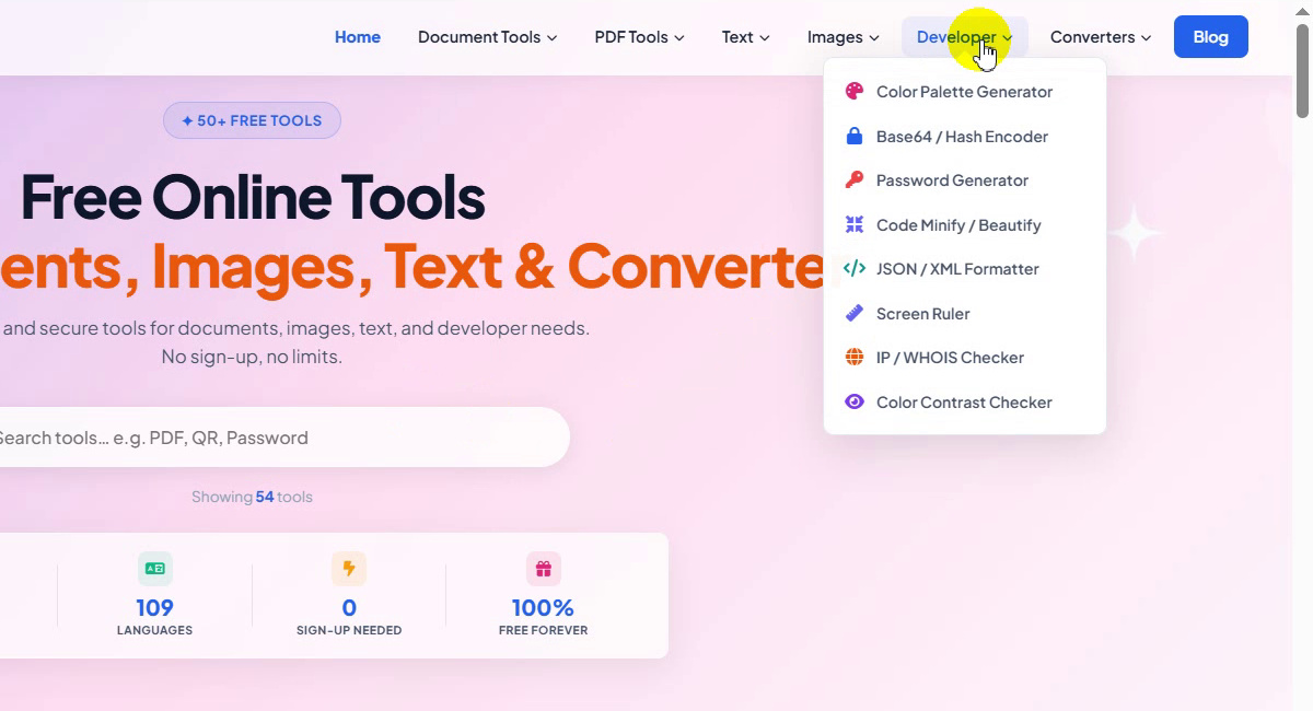
Open the Developer menu
On the ToolTiny home page, move the mouse over Developer in the top bar. The menu lists Color Palette Generator, Base64 / Hash Encoder, Password Generator, Code Minify / Beautify, JSON / XML Formatter, Screen Ruler, IP / WHOIS Checker and Color Contrast Checker.
Developer menu -
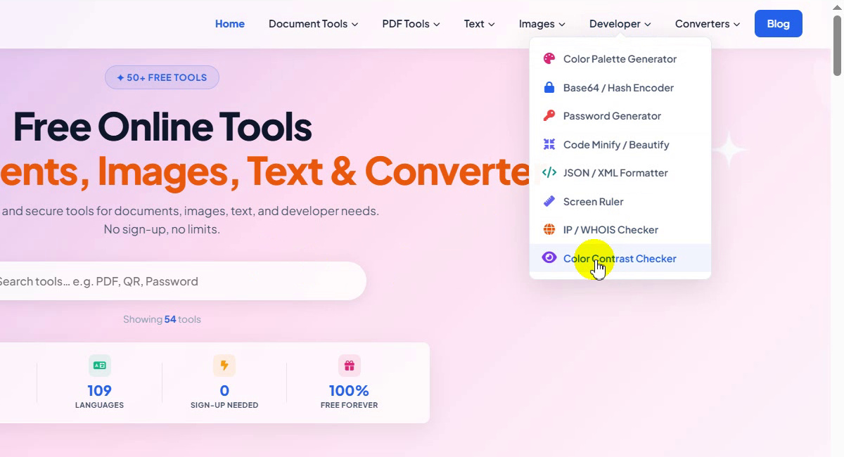
Choose Color Contrast Checker
Click Color Contrast Checker at the bottom of the list, or go straight to tooltiny.com/color-contrast-checker.html.
Developer → Color Contrast Checker -
Look at the tool page
The Color pair box has Quick presets, a Text / foreground color field and a Background color field. It opens with white text (#ffffff) on a black background (#000000). Each field shows its color as HEX, RGB and HSL. The page accepts HEX (3, 4, 6 or 8 digits),
rgb(),hsl()and CSS color names.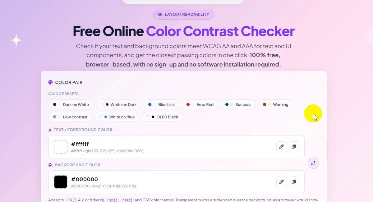
The Color Contrast Checker page -
Try a quick preset
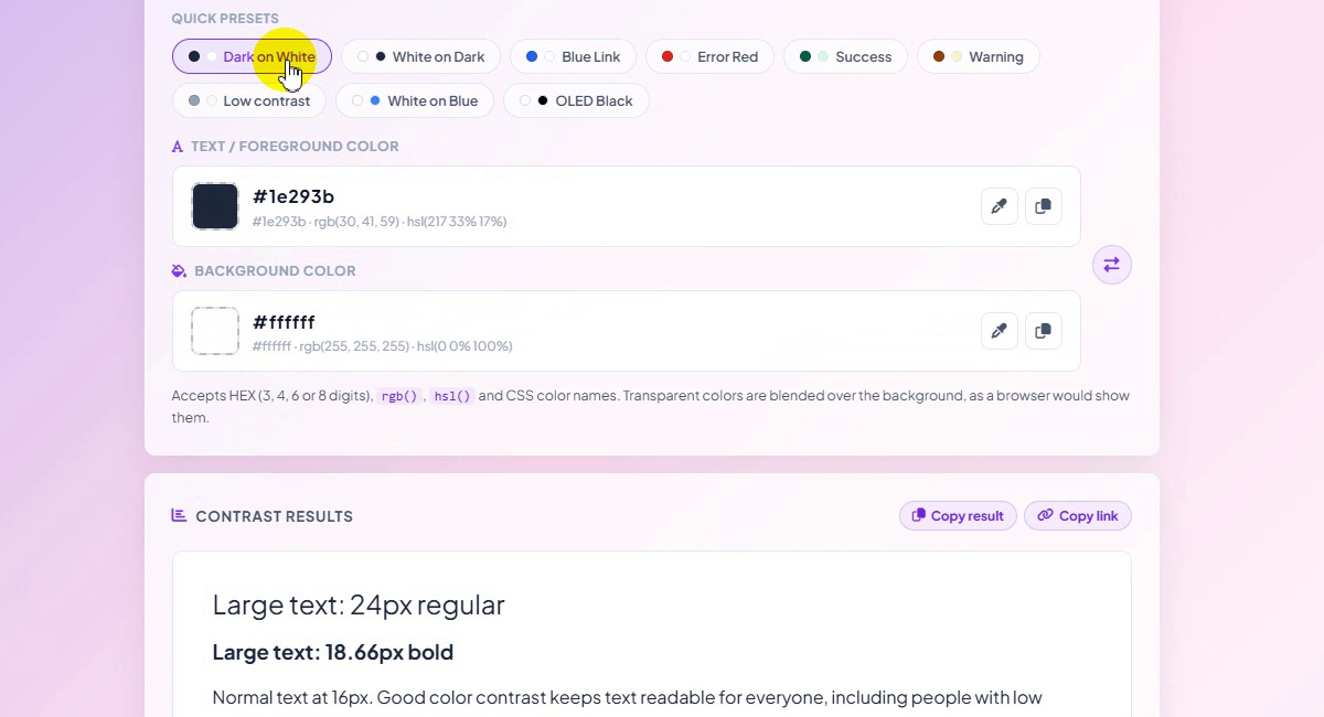
Click a preset to load a ready-made pair. We started with Dark on White, which fills in #1e293b text on a #ffffff background. The other presets are White on Dark, Blue Link, Error Red, Success, Warning, Low contrast, White on Blue and OLED Black.
Dark on White preset -
See how the other presets look
In the recording we clicked through all nine presets. Every click changes the fields and the preview at once. Success, for example, gives #065f46 text on a #d1fae5 background.
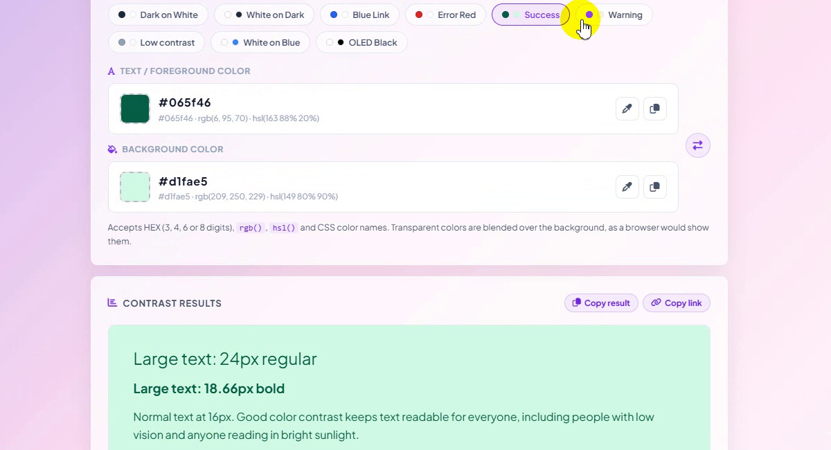
Success preset: #065f46 on #d1fae5 -
Check the live preview
Scroll down to Contrast results. The preview shows your pair the way readers will see it: large text at 24px regular and 18.66px bold, normal text at 16px, small text at 13px, a button, an input field, two icons and a link. Here it is white on black (OLED Black). Copy result and Copy link sit at the top right of this box.
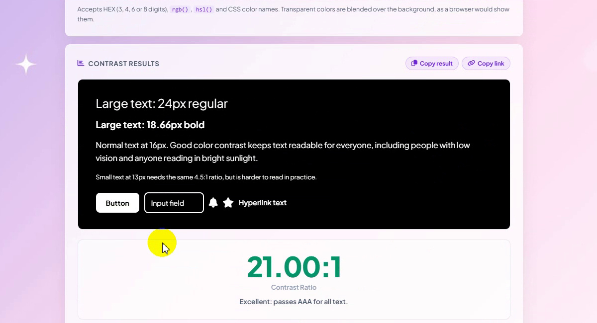
Live preview of the pair -
Read the ratio and the five checks
Under the preview, the big number is the contrast ratio: 21.00:1 for white on black, with the note “Excellent: passes AAA for all text.” The bar runs from 1:1 (no contrast) to 21:1 and is marked at 3, AA 4.5 and AAA 7. Five cards show what the pair passes: AA Normal Text (needs 4.5:1, WCAG 1.4.3), AA Large Text (3:1, WCAG 1.4.3), AA UI & Icons (3:1, WCAG 1.4.11), AAA Normal Text (7:1, WCAG 1.4.6) and AAA Large Text (4.5:1, WCAG 1.4.6). All five are green here.
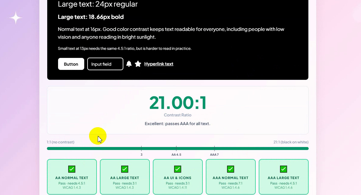
21.00:1: all five checks pass -
Open the color picker
To test your own colors, click the small color swatch at the left of the text color field. A picker opens with a color area, a hue slider, an eyedropper and R, G and B boxes (255, 255, 255 for white). You can also type a value straight into the field.
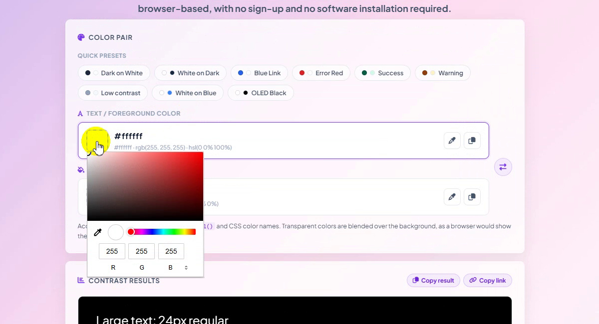
Click the swatch to open the picker -
Pick a text color
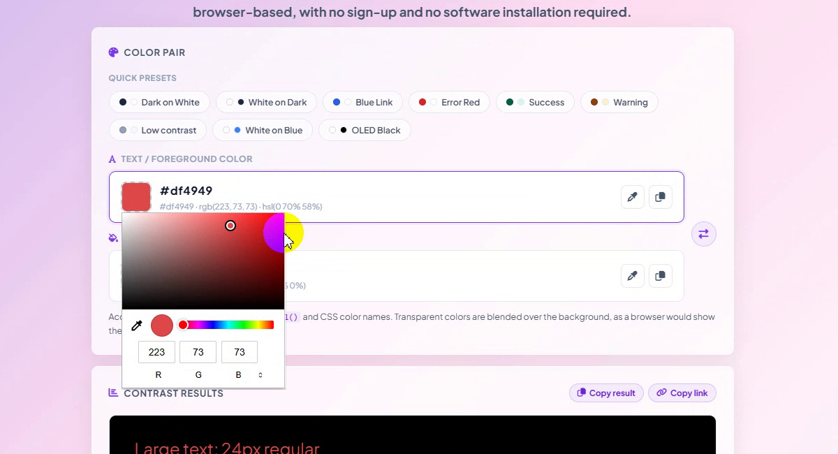
Drag in the color area. We chose a red: #df4949, shown as rgb(223, 73, 73) and hsl(0 70% 58%). The R, G and B boxes read 223, 73 and 73, and the preview text turns red at once.
Text color: #df4949 -
Pick a background color
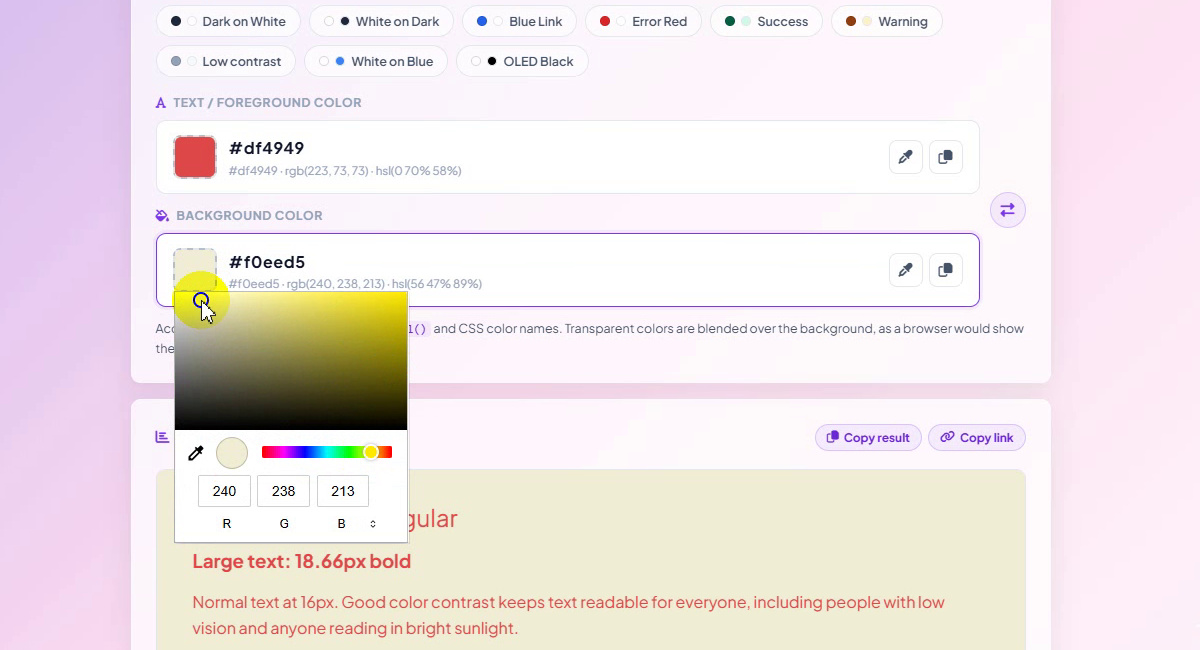
Open the Background color picker the same way. While we dragged it the preview background moved from black through yellow, dark olive and grey to a pale cream. We stopped at #f0eed5, which is rgb(240, 238, 213).
Background color: #f0eed5 -
Read the new result
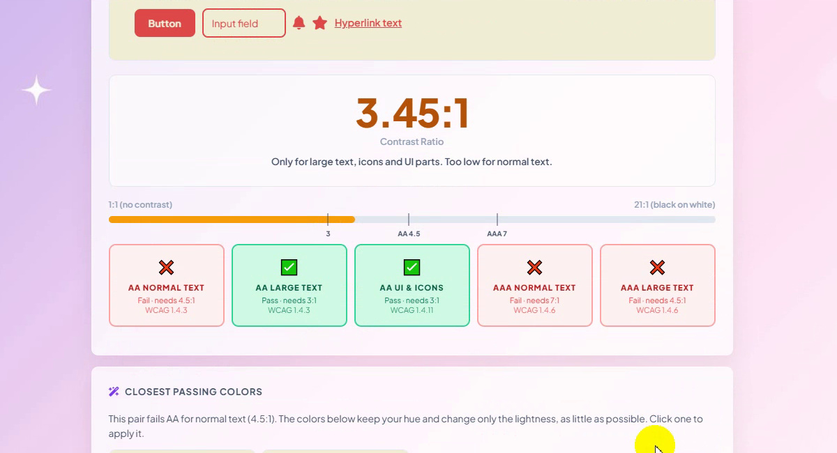
The ratio is now 3.45:1, with the note “Only for large text, icons and UI parts. Too low for normal text.” AA Normal Text fails (needs 4.5:1), AA Large Text and AA UI & Icons pass (3:1), and both AAA cards fail. The orange bar stops just past the 3 mark.
3.45:1: large text and UI only -
Use the closest passing colors
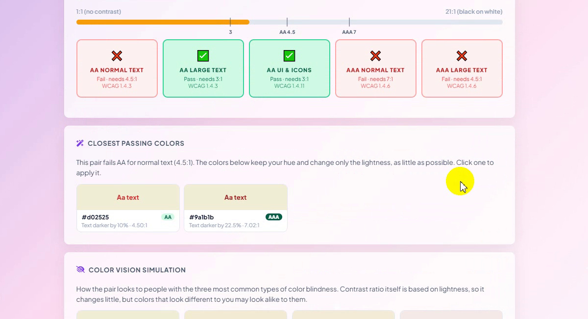
Because the pair fails AA for normal text, the tool suggests two fixes that keep your hue and change only the lightness, as little as possible: #d02525 (AA, text darker by 10%, 4.50:1) and #9a1b1b (AAA, text darker by 22.5%, 7.02:1). Click one to apply it; we did not click one in the recording. Below them, Color vision simulation shows how the pair looks to people with the three most common types of color blindness.
Closest passing colors
Our Two Test Pairs
| Pair | Ratio | AA normal | AA large | AA UI | AAA normal | AAA large |
|---|---|---|---|---|---|---|
| #ffffff on #000000 | 21.00:1 | Pass | Pass | Pass | Pass | Pass |
| #df4949 on #f0eed5 | 3.45:1 | Fail | Pass | Pass | Fail | Fail |
| #d02525 on #f0eed5 (suggested) | 4.50:1 | Suggested for AA | ||||
| #9a1b1b on #f0eed5 (suggested) | 7.02:1 | Suggested for AAA | ||||
The ratios, the pass and fail results and the two suggested colors are the ones the tool showed in the recording.
Good to Know
- The ratio is about lightness, not hue. Two very different colors can still have a low ratio if they are about equally light.
- One pair, five checks. A pair can pass some cards and fail others, as our 3.45:1 pair did.
- Transparent colors are blended over the background, as a browser would show them.
- We did not apply a suggestion in the recording; clicking one fills it in as your text color.
- Private: the checker works in your browser. Nothing is uploaded.
Tips
- Test the real pair. Check the exact text color on the exact background it sits on, not a nearby color.
- Check buttons, borders and icons too. They need 3:1 under the AA UI & Icons card.
- Small text is the hard case. Body copy at 16px or smaller needs 4.5:1 for AA, so a pair that only passes the large-text card is not enough for paragraphs.
- Keep your brand hue. Use the closest passing colors instead of switching to black or white.
- Share the pair. Use Copy result or Copy link at the top right of the results box.
- Choosing colors from scratch? Read how to pick colors and build a palette, then check each text and background pair here. More guides are on our blog.
Type or pick two colors and get the WCAG result instantly. Free, private, no sign-up.